
Today’s topic is a new feature added to the Data-Shapes package: UI Charts. It’s been a WIP for a little while and it’s now live !! 😊. It basically allows Data Viz directly on a Data Shapes Form using the UI.MultipleInputForm++.
The first version is now ready to be shared and will be followed by updates and improvements. You’ll probably come up with great ideas, so feel free to reach out and tell us how you’d like to see it evolve (we already have a few ideas… 😉).
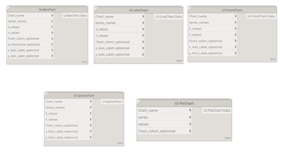
5 types of charts are available for now (more coming…!!):
- Point Charts
- Line Charts
- Spline Charts
- Bar Charts
- Pie Charts


Working with one series:
Series refer to sets of data points. These datasets can be unique or multiple depending on what’s to be plotted. If you’re working with one series, input the Series Name, the table containing your X-Values (as strings), and the one with the Y-Values. The other inputs are optional and will be described later.
For now, charts from the Data Shapes Package are colored by Series, except for the Pie Chart. The Series Names are displayed in the Legend.
The very basic example below consists in visualizing the number of different Door Types (“Door Type A”, “Door Type B”, “Door Type C”) in the Building 1 on a Bar Chart.


You might need to set the Width and the MaxHeight of the UI++Multiple Input Form to have a convenient form size for the chart to be readable.
You can now run the script and have a look at the result!
For simplicity, the number of doors were manually given, but counting the number of doors could (should) be done automatically of course…!!

The chart interface is the following:
 The name of the chart is displayed in the top left corner of the form
 The legend is located on the top right corner
 Three controls are available in the bottom right corner of the form. These controls allow you to show/hide the legend by unchecking the box labelled “Show/Hide legend” (when working with one series, the legend might not be consistent to show…). You can do the same with the labels displayed on the charts.
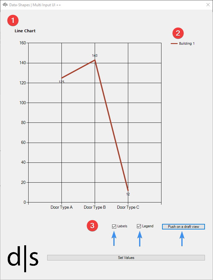
The last control allows you to push the chart on a draft view. Yes, now that your wonderful chart is drawn in the form, you’d probably like to have it in Revit and be able to manipulate it as an image. The button “Push on a draft view” imports the chart as an image in a new Draft View that inherits the name of the chart, followed by the date/time it was created.

The exported image can now be added to the View(s) / Sheet(s) you want 😊
Working with multiple series:
When working with multiple series, you should input as many Series Names as Series needed. You should also have as many Y values as there are series for each X value.
Let’s get back to our example. Now, we would like to visualize the number of different Door Types (“Door Type A”, “Door Type B”, “Door Type C”) and make a comparison in between each Building. The comparison will be visualized on a Point Chart:

And you’ll get the following result on a Bar Chart:

Custom colors ad Axis Labels:
Like I said before, Chart Colors are defined by Series. If you’re working with only one series, you’ll only get one color (except if you go for the Pie Chart …😉). When working with multiple series, one color by series is defined. These colors can be customized: simply add a list containing as many colors as Series in your chart! The order of the Color Inputs should be the same as the series order (same with values for a Pie Chart).
Note: By default, the BrightPastel Chart palette is applied.

You can also set the names of the X and Y Axis of your chart. By default, the Axis Titles are empty.

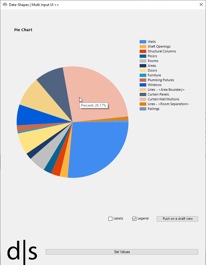
TOOLTIPS:
When moving your mouse over an element, a tooltip showing the percentage of the value relatively to the total is shown in a tooltip.
Now, you have everything to push your data in your model !

And that’s pretty much it ! We hope you’ll find it useful and we’re looking forward to your ideas ! So please feel free to comment on how you think this can be improved !
Chart Examples
Spline Chart


Line Chart


Bar Chart


Pie Chart


Point Chart


This is a hit!! hi man, how can i try your tool?
LikeLiked by 2 people
Hi 🙂
Just search for the Data-Shapes package in Dynamo and download it if you haven’t already ! If you’re already using the package, make sure to grab the last version of it and you’ll be able to use these features 🙂
LikeLiked by 1 person
Absolutely Amazing Job DataShapes. I love how you guys keep pushing the envelope of capabilities with Revit.
That being said, I noticed the UI.MultiInputForm will show multiple charts, but when you “Push to Drafting View” (on lets say 2 charts), only 1 image shows up in both views. Can you alter it to allow for multiple types of charts to show?
Thank you so much,
KB
LikeLike
Hi Kevin,
Thanks for the kind words and thank you for your feedback ! The package was updated, it should be working now 🙂 !
LikeLike
Hi,
thank you for the package.
I tried to use barchart and x values are 20 values but it is not plotted on x-axis. do you have solution of it?
LikeLike
Hi,
Could you share some more info on the script you made and the inputs you have set to the Bar Chart node ? Is your Y values list 20 members long as well ? Did you use one or multiple series ? 🙂
LikeLike